

Friday, 16 December 2011
Thursday, 15 December 2011
Moderator Post
Dear Moderator,
Thanks for taking the time to look around my blog i hope you thoroughly enjoy it.
Thanks for taking the time to look around my blog i hope you thoroughly enjoy it.
I have linked my group blog to this personal blog as well as links to my teachers blogs and group member's blog. Both are found on the right hand side.
On the blog you will find my individual research and planning, production and evaluation into music videos and the music industry and will find more on the group blog as well.
My music video, album cover and link to our website is all at the top of the blog.
To help navigate through the blog you can use the labels noted on the right hand side -hope you enjoy it!
Thanks, Philippa
Monday, 12 December 2011
Question 1: In what ways does your media product use, develop or challenge forms and conventions of real media products?
To answer this question we decided to create a video response in which we talk about how we feel we 'used, developed and challenged' forms and conventions of real media products to achieve our final pieces of work, including our final edit (the main product), website and album cover(anchillary products).
LINKING THESE IDEAS TO GENRE aAND RELEVANT VIDEOS OF INSPIRATION
I drew particular inspiration from this video 'Coffee shop soundtrack by All Time Low' which is a completely different genre of music to ours, being punk rock rather than indie, therefore making our band stand out from their own genre and potentially catching the audiences eye. The video above is quite casual and has fairly uninteresting sets but they use them in funny, quirky and entertaining ways to make the video pleasurable to watch. As well as this the grading almost makes it seem quite home made which i feel ours has as well.

Again we made the decision for our own music video to focus more on the fun and entertainment compared to the actual preffsionalism of the instrument playing which is similar to this video as we never actually see the band playing their instruments in a serious set. The camerawork is often still and front on and has the actors directly addressing the camera almost like 'webcam' or a bit tongue and cheek. We decided to use similar shots within our video to create a professional yet amateur feel to the video to create an approachable band image and make the audience feel it is easier to relate to them which i feel is important for a debut video (as shown below).

The video focuses alot on comedy, creating a clear fun band image, which ours also does such as the spooning shot etc.

The video also draws on the knowledge of the audience to emphasise the comedy, that gymnastics is a very hard and girly sport. We decided to develop this drawing of knowledge and change it to the knowledge of popular culture using famous movie villains (Darth Vader, The Joker and Dr Evil) doing silly, unimaginable things, to give the video more comedy value.

This video 'Teddy Picker by the Arctic Monkeys' is the same indie genre as our band but as you can see from watching the video has a vastly different feel to the video, which alot of videos from this genre have and so we feel we have broken many conventions of the genre. This video is alot more serious, with no elements of comdey, as well as this, compared to our video, this one is alot more focused on the proffessionalism of the band, playing their instruments well etc. shown by the majority of the video being them actually recording the song in a studio and with ours there is a clear lack of this serious performance.

Again with this video, the band is very easily identifyable with many shots of them all together just walking casually down the road, however ours completely breaks this convention of making the band identifyable by putting three of its members in costume, however this gives our video an enigmatic feel which could make the audience more inclined to go to our website to find out more- encouraging use of the ancillary products.

Overall the main difference is the portrayaly of image, with ours being alot more fun and quirky rather than serious and professional.
Analysing our video according to Vernallis:
Our video follows mainly follows Vernallis's conventions breaking all rules of continuity editing which we used when editing our video to make it visually entertaining to the audience. We did things such as using jump cuts,breaking the 30 degree rule and , and we also didn't follow a linear pattern as to shot types, jumping from closeups to longshots etc.

Our editing matched musical phrases and was most of the time to the beat, and editing was the focal point sometimes as well, for instance in the shots we made slow or fast motion.
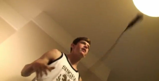
We also support Vernallis's narrative conventions, he states that the narrative doesn't normally have a clear resolution or ending and in our video the ending is unclear as to wether the whole thing was a dream as he wakes up again alone after falling asleep with the villains questioning the whole narrative that the villains had come in to help him sleep.
![]()
Our Album Cover
The album cover we created for 'Small Town America- Route 66' follows most conventions of real album covers. For example the road trip americanised theme of the cover runs the whole way through each page of the album cover. As well as this the back follows rules and conventions having all the essential information for instance, the barcode, track listing and institutional information. For a debut album it is essential for the band name to be large and easy to spot, which ours is and the album name is also easy to spot. However, going against conventions we again, like our music video, almost mask our bands faces by making them cartoonised but we feel this gives it an enigma which makes the audience buy the album to find out more about the band, also the bands faces are shown INSIDE the album which would also encourage them to buy it to find out the identities, or even just check out our website.

Our Website
Our website follows greatly the conventions of a website, by allowing the audience to recognise the band image again by sticking with the road trip background/theme. There are clear links to buy the album and single and also to check out the youtube page and production company. We have many ways as well for the audience to engage with the band and feel more in touch with them such as competitions winning personalised merchandise, a comments box on the videos page, a place to send messages to the group ad also a merchandise shop full of fun Small Town America clothing. The website is easy yet fun to navigate through, and everything links into one another. We have lots of albums of photos to also give the audience insight into the members of the band, behind the scenes of the music video and standard photoshoots.

LINKING THESE IDEAS TO GENRE aAND RELEVANT VIDEOS OF INSPIRATION
I drew particular inspiration from this video 'Coffee shop soundtrack by All Time Low' which is a completely different genre of music to ours, being punk rock rather than indie, therefore making our band stand out from their own genre and potentially catching the audiences eye. The video above is quite casual and has fairly uninteresting sets but they use them in funny, quirky and entertaining ways to make the video pleasurable to watch. As well as this the grading almost makes it seem quite home made which i feel ours has as well.

 |
| As you can see the grades are fairly similar and quite yellow giving them a home made feel. |
Again we made the decision for our own music video to focus more on the fun and entertainment compared to the actual preffsionalism of the instrument playing which is similar to this video as we never actually see the band playing their instruments in a serious set. The camerawork is often still and front on and has the actors directly addressing the camera almost like 'webcam' or a bit tongue and cheek. We decided to use similar shots within our video to create a professional yet amateur feel to the video to create an approachable band image and make the audience feel it is easier to relate to them which i feel is important for a debut video (as shown below).

 |
| Here you can see the similar direct adress. |
The video focuses alot on comedy, creating a clear fun band image, which ours also does such as the spooning shot etc.

 |
| These photos show the same fun jokey theme both videos capture. |
The video also draws on the knowledge of the audience to emphasise the comedy, that gymnastics is a very hard and girly sport. We decided to develop this drawing of knowledge and change it to the knowledge of popular culture using famous movie villains (Darth Vader, The Joker and Dr Evil) doing silly, unimaginable things, to give the video more comedy value.

 |
| Here you can see the popular culture of knowing about the villains and gymnastics to emphasise the hilarity of the video. |
This video 'Teddy Picker by the Arctic Monkeys' is the same indie genre as our band but as you can see from watching the video has a vastly different feel to the video, which alot of videos from this genre have and so we feel we have broken many conventions of the genre. This video is alot more serious, with no elements of comdey, as well as this, compared to our video, this one is alot more focused on the proffessionalism of the band, playing their instruments well etc. shown by the majority of the video being them actually recording the song in a studio and with ours there is a clear lack of this serious performance.

 |
| As you can see in our video the lead singer messes around with his microphone compared to the formality of the recording studio. |
Again with this video, the band is very easily identifyable with many shots of them all together just walking casually down the road, however ours completely breaks this convention of making the band identifyable by putting three of its members in costume, however this gives our video an enigmatic feel which could make the audience more inclined to go to our website to find out more- encouraging use of the ancillary products.

 |
| The Arctic Monkeys get clear shots of the full band whereas we mask some of our characters faces. |
Overall the main difference is the portrayaly of image, with ours being alot more fun and quirky rather than serious and professional.
Analysing our video according to Vernallis:
Our video follows mainly follows Vernallis's conventions breaking all rules of continuity editing which we used when editing our video to make it visually entertaining to the audience. We did things such as using jump cuts,breaking the 30 degree rule and , and we also didn't follow a linear pattern as to shot types, jumping from closeups to longshots etc.
Our editing matched musical phrases and was most of the time to the beat, and editing was the focal point sometimes as well, for instance in the shots we made slow or fast motion.
 |
| This sequence we made fast motion in our piece to add extra comical effect |
We also support Vernallis's narrative conventions, he states that the narrative doesn't normally have a clear resolution or ending and in our video the ending is unclear as to wether the whole thing was a dream as he wakes up again alone after falling asleep with the villains questioning the whole narrative that the villains had come in to help him sleep.
Our Album Cover
The album cover we created for 'Small Town America- Route 66' follows most conventions of real album covers. For example the road trip americanised theme of the cover runs the whole way through each page of the album cover. As well as this the back follows rules and conventions having all the essential information for instance, the barcode, track listing and institutional information. For a debut album it is essential for the band name to be large and easy to spot, which ours is and the album name is also easy to spot. However, going against conventions we again, like our music video, almost mask our bands faces by making them cartoonised but we feel this gives it an enigma which makes the audience buy the album to find out more about the band, also the bands faces are shown INSIDE the album which would also encourage them to buy it to find out the identities, or even just check out our website.

Our Website
Our website follows greatly the conventions of a website, by allowing the audience to recognise the band image again by sticking with the road trip background/theme. There are clear links to buy the album and single and also to check out the youtube page and production company. We have many ways as well for the audience to engage with the band and feel more in touch with them such as competitions winning personalised merchandise, a comments box on the videos page, a place to send messages to the group ad also a merchandise shop full of fun Small Town America clothing. The website is easy yet fun to navigate through, and everything links into one another. We have lots of albums of photos to also give the audience insight into the members of the band, behind the scenes of the music video and standard photoshoots.

Question 2: How effective is the combination of your main product and ancillary products?


 |
| Shots from the website |


 |
| The inner cover of our album |

 |
| Front Cover- masked faces |
 |
| Inner Cover- revealed faces |
 |
| About us page |
 |
| Individual photoshoots page (1 per band member) |
The website has many clear and easy links to buy the album and single on iTunes and not only this but has a whole page dedicated to the music video and when it premiers also features on the 'news' page to encourage the watching of this, there is also a link to youtube where the audience can also obviously watch the video.
 |
Where to purchase the song/album on the website  |
The overall emphasis on the fun, free spirited vibe of the band is drawn on throughout all the three pieces, with images of the band doing silly and tongue and cheek things in all three products.
 |
| shots from the individual photoshoots page on the website but also some of these funny images feature on the inner cover of the album. |


 |
| A screen shot of an immaturely funny bit to our music video. |
On the album cover the colour of each band member stays the same through all of the cover so as to build up a motif to the particular member which the audience will recognise in future work.


So overall to answer the question i feel the effectiveness of all three products is very great, as each product allows and encourages the use of all three, with the website as an overall hub connecting all the three together- the purchasing of the album/single and the watching of the new video. As well as this the production company is grouping the products together- being featured on the album cover and on the website giving institutional information.

The Americanised theme i feel is prominent throughout to allow a clear band image to be created and recognised by fans.
However if we were to do it again i would increase the effectiveness by possibly drawing more on the link between the video and the album cover possibly by putting a Route 66 poster on the wall of the set of the music video to act as subliminal messaging into the album and emphasises the Americanised theme. Although i believe these don't need to link THAT closely as the single needs to be distinctive to the song whereas the album needs to be distinctive to the band image in general.
Question 3: What have you learnt from your audience feedback?

We feel our audience demographic is16-24 year olds because our band image is really fun and immature, deemed too immature for people any older than that. Small Town America is very image based, we are all about having a good time and not caring about what other people think, this fit in well at festivals as they create an energetic atmosphere and can get the crowd going. We reasoned that teenagers and young adults are the largest participants of festivals making our audience and band image work well together in synergy.


 |
| The image of the band particularly will interest girls at a glance. |
 |
| The rebellious nature of the music video appeals to younger audiences. |
To gather audience feedback we had arranged a screening of our music video in a studio and recorded the reactions of these people watching it. Loads of people turned up but to make our feedback more thorough we also carried out a focus group of 10 people to fill out questionnaires about the video, album cover and website. We had a mixture of people within the group from 16 year olds to 30 year olds as to make sure we had covered most demographics so we could really see where our core audience was.
From the samples of audience feedback we received very positive and encouraging responses from those aged around 15-19 and 20-25. however their were a few questions concerning the beginning and end of the piece.

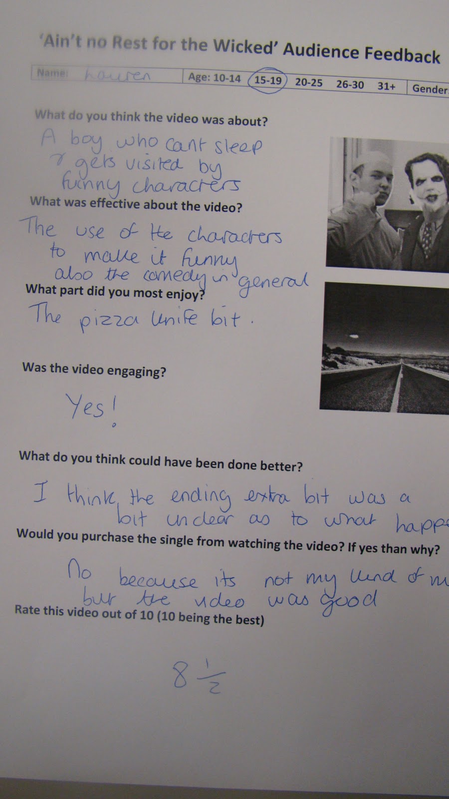
Although very positive feedback with averaging scores of 81/2 to 9 it was clear that the audience felt beginning of the song took too long to build up and the end was 'unclear' as to what happened (was it a dream? etc.) This lack of clarity was clear in our audience response video where people clapped too early thinking it had finished.

The feedback overall was mostly positive however the higher end of the spectrum seemed to not enjoy the song itself (a distaste to the genre), and so would not buy into the band.
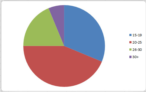 |
| A pie chart showing in the different age brackets how many people would 100% buy the song/album |
Rob a 25 year old who we asked to evaluate our video said 'I don't like the song' and 'Its not serious enough' which is clear evidence of the older ages not liking the song, however he did have some good points to say about the video 'it had some funny moments'. Despite the older half of our target audience not enjoying the song I still feel we have targeted the audience we identified for our band at the beginning of the project successfully and we had a superb response during and after our screening.

From the responses i feel we successfully targeted our audience although being a new twist on an indie band (with the more fun image and approach), and from altering the image of this indie band, we have managed not only to appeal to fans of the music within the indie genre but also to punk rockers who like the fun free image other punk bands carry such as Bowling for Soup and All Time Low. I feel the main reason for our sucessful broad appeal was due to the comedy and intertextuality of the piece.
Album Cover
We also constructed questionnaires for our focus group asking about the album cover. Many people found it eyecatching, fun and colourful overall saying they would be drawn to it on a shelf and potentially pick it up 'the colour scheme is eye-catching' . They all liked the cartoony effects we had put on the landscape and the band members and said we had captured the laid back yet fun image of the band perfectly well with the front cover being laid back and the inner cover being funny. The inner cover of the digipack was a big hit and many people thought it was highly original and helped keep the colour scheme running throughout which really emphasised the band image, not only this but it helped link the album cover with the video and developed the band image with the quirky funny faces.
We had great responses from the broad spectrum of people, even adults who were not fans of the genreand did not like the song overall saying that the albums greatest strengths was that it was visually appealing- meaning even if it didnt get bought it would definitely be picked up from a shelf and looked at increasing band awareness and could act as a ripple effect with the older people maybe buying it for their children who they know ARE fans of the genre.


Our website was ultimately a hub linking all three of the products we created (being able to watch the video on it and buy the single/album aswel) it was majorly centred around interactivity to gratify the needs of the consumer and so we were positive the feedback would be good on it.

We recieved alot of positive feedback about the whacky, scrapbook style and colour scheme of the website making it bright and engaging. As well as this the feedback on the practicality of the website was excellent saying it was easy to navigate, had sufficient information, links to many places to make purchasing easier and lots of pictures to catch the eye.

The merchendise was also a big hit with most people saying that it was stylish yet symplistic with lots of choice and reasonable prices.

Many people picked up upon the highway background and American roadtrip theme, which was also on the album cover creating a clear band image and accosiate the open road, America and touring now with Small Town America.


We asked our focus group whether or not they thought we could have done more to interact with the band and they seemed to think we had covered all the areas needed.
They thought the 'gallery' of the band and the 'about me' sections broadened their knowledge of the band and said they were intreguing and they were drawn to them because of the hidden nature of the identity within the other products.
The audience also stated that the simplistic navigation bar 'made it easy to find things to do' and that 'every page is very visual with lots of things to look at'.


From my audience feedback I have learnt that the biggest influence of people to pick something up is eyecatching visuals and so this is something which should be largely used in attracting the audience.
I have also learnt that the image of our band mainly attracts a young target audience, around the same age of the band as they can relate or aspire to be like their fun and care-free ways.
I believe the importance of audience feedback is very high as it allows you to understand wether you have sucessfully achieved to attract an audience for your product, not only this but it allows you to understand where you went wrong with the targeting and what you would need to change in the future or in hindsight, for instance in our video- the ending.
Subscribe to:
Comments (Atom)